This is the last tutorial of the Full-stack XM Cloud Development Guide.
So we've covered 2 parts: How to Set Up Docker for XM Cloud Dev and Full-Stack Local XM Cloud Dev Environment Tutorial.
This Full-stack XM Cloud Development Guide is written by Yaochang Liu, a Sitecore Content Hub Administrator Certification winner and experienced developer from Qedge. Yaochang, we really appreciate your effort!
So, let's get started.
Component Development Process
📘Basic Process
1. Create a Datasource Template
/sitecore/templates/Project/Components/Demo/Demo1Component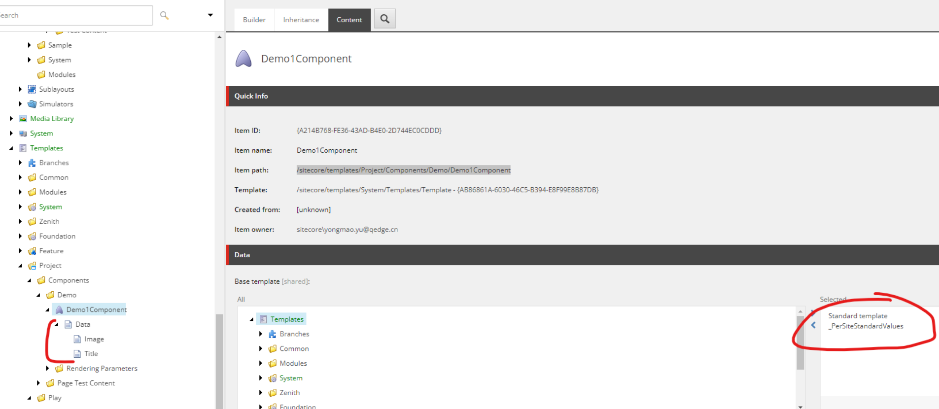
2. Create a Parameters Template
Create a Parameters Template and build Standard Values
/sitecore/templates/Project/Components/Demo/Rendering Parameters/Demo1 Parameters
3. Create a JSON rendering
/sitecore/layout/Renderings/Project/Play/Demo Component/Demo1Edit the following fields:
- Parameters Template: Select the Parameters Template created in step 2.
- Datasource Template: Select the Datasource Template created in step 1.

4. Create Available Rendering
Add the JSON Rendering created in Step 3 to the corresponding Available Rendering
/sitecore/content/Play/Play/Presentation/Available Renderings/Demo Component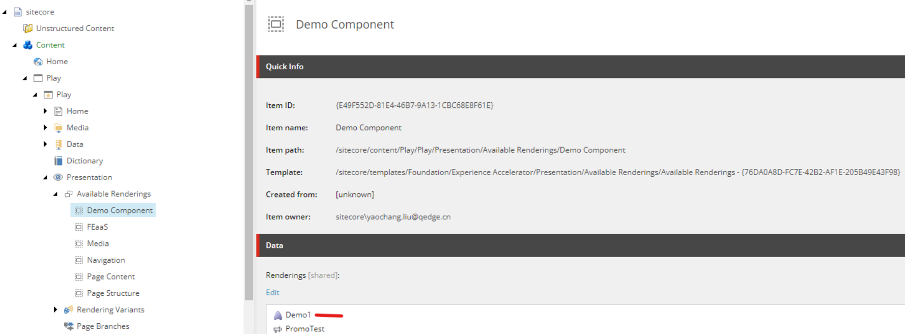
5. Create Variants
/sitecore/content/Play/Play/Presentation/Headless Variants/Demo16. Create Variant Definition
/sitecore/content/Play/Play/Presentation/Headless Variants/Demo1/Default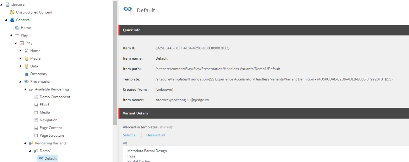
7. FE coding
The file name should be consistent with the Component Name in step 3 of the JSON rendering and should not contain any spaces.


import React from 'react';
import {
    Image as JssImage,
    Text,
    ImageField,
    TextField,
} from '@sitecore-jss/sitecore-jss-nextjs';

interface Fields {
    Image: ImageField;
    Title: TextField;
}

type Demo1Props = {
  params: { [key: string]: string };
  fields: Fields;
};

const Demo1DefaultComponent = (props: Demo1Props): JSX.Element => (
    <div className={`component promo ${props.params.styles}`}>
        <div className="component-content">
            <span className="is-empty-hint">Demo1</span>
        </div>
    </div>
);

export const Default = (props: Demo1Props): JSX.Element => {
    const id = props.params.RenderingIdentifier;
    if (props.fields) {
        return (
            <div className={`component promo ${props.params.styles}`} id={id ? id : undefined}>
                <div className="component-content">
                    <div className="field-promoicon">
                        <JssImage field={props.fields.Image} />
                    </div>
                    <div className="promo-text">
                        <div>
                            <div className="field-promotext">
                                <Text field={props.fields.Title} />

                            </div>
                        </div>

                    </div>
                </div>
            </div>
        );
    }

    return <Demo1DefaultComponent {...props} />;
};
Note: Ensure that the export const Default is consistent with the name "Default" in step 6 of the Variant Definition.
✈️Advanced Techniques
Nest Components within Components (static placeholder) and/or using multi-variant.
1. Create a Placeholder
/sitecore/layout/Placeholder Settings/Project/Play/Demo1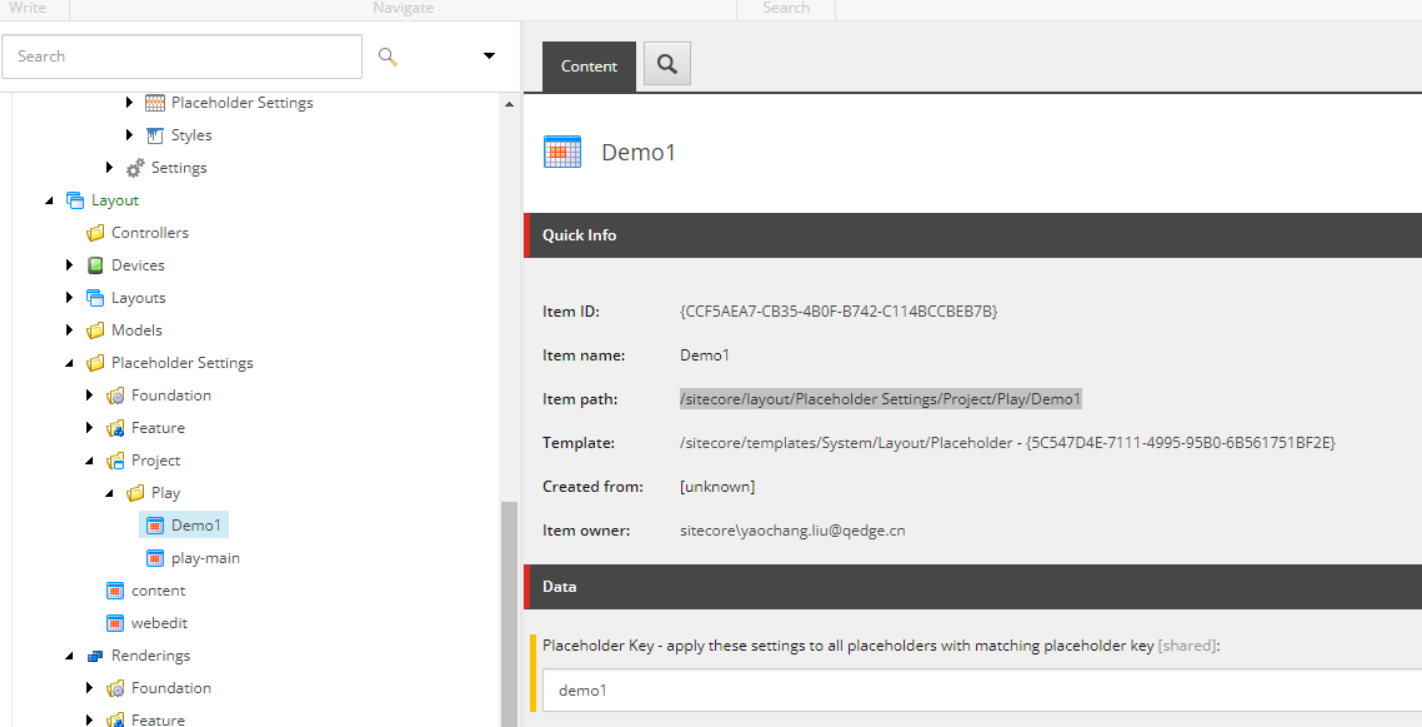
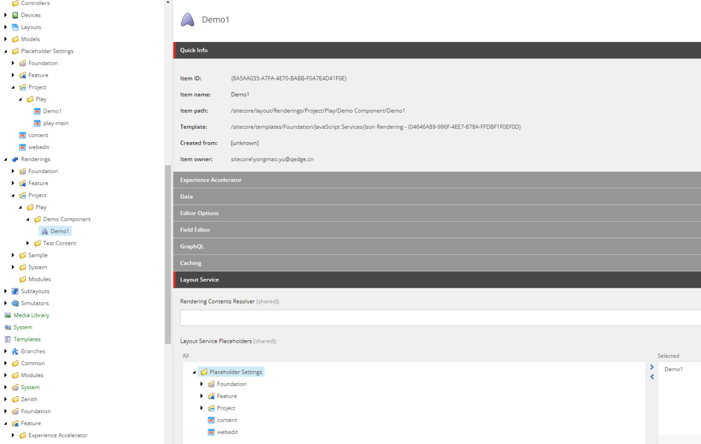
2. Update Rendering
Modify the Layout Service Placeholders in the JSON Rendering.
Select the Placeholder added in the previous step.
3. Set placeholder restrictions
Add placeholder to the appropriate path
/sitecore/content/Play/Play/Presentation/Placeholder Settings/Demo1/Demo1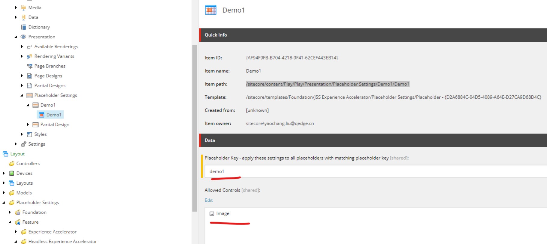
4. Add a Variant Definition
/sitecore/content/Play/Play/Presentation/Headless Variants/Demo1/WithSub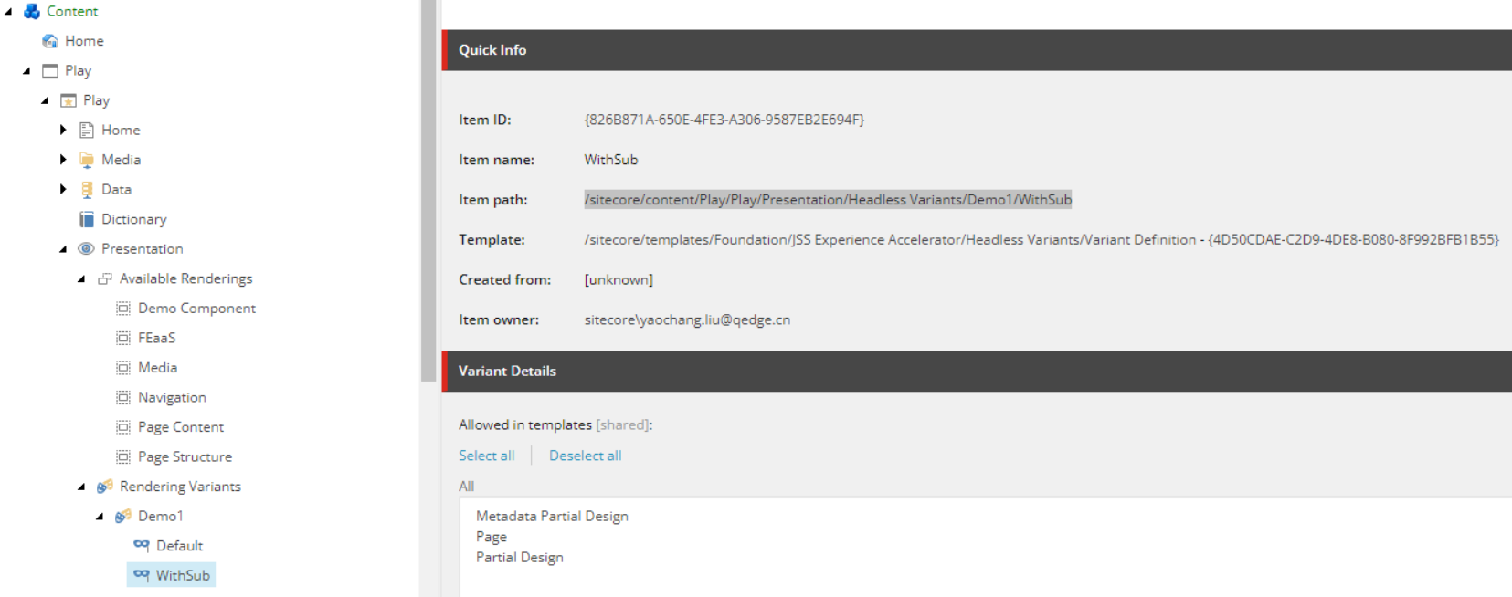
5. FE coding
import React from 'react';
import {
Image as JssImage,
Text,
ImageField,
TextField,
Placeholder,
} from '@sitecore-jss/sitecore-jss-nextjs';
import { ComponentProps } from 'lib/component-props';
interface Fields {
Image: ImageField;
Title: TextField;
}
type Demo1Props =
ComponentProps & {
fields: Fields;
};
const Demo1DefaultComponent = (props: Demo1Props): JSX.Element => (
<div className={`component promo ${props.params.styles}`}>
<div className="component-content">
<span className="is-empty-hint">Demo1</span>
</div>
</div>
);
export const Default = (props: Demo1Props): JSX.Element => {
const id = props.params.RenderingIdentifier;
if (props.fields) {
return (
<div className={`component promo ${props.params.styles}`} id={id ? id : undefined}>
<div className="component-content">
<div className="field-promoicon">
<JssImage field={props.fields.Image} />
</div>
<div className="promo-text">
<div>
<div className="field-promotext">
<Text field={props.fields.Title} />
</div>
</div>
</div>
</div>
</div>
);
}
return <Demo1DefaultComponent {...props} />;
};
export const WithSub = (props: Demo1Props): JSX.Element => {
const id = props.params.RenderingIdentifier;
if (props.fields) {
return (
<div className={`component promo ${props.params.styles}`} id={id ? id : undefined}>
<div className="component-content">
<div className="field-promoicon">
<JssImage field={props.fields.Image} />
</div>
<div className="promo-text">
<div>
<div className="field-promotext">
<Text field={props.fields.Title} />
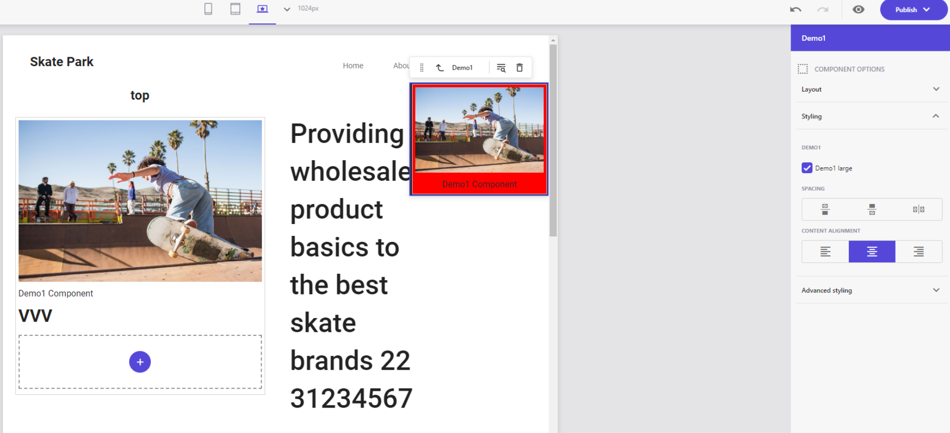
<h1>VVV</h1>
<div className="row">
//The following is for nesting components
<Placeholder name="demo1" rendering={props.rendering} />
</div>
</div>
</div>
</div>
</div>
</div>
);
}
return <Demo1DefaultComponent {...props} />;
};
📝 Styles
1. Add Styles
Add the JSON Rendering to the Allowed Renderings of the corresponding Style
/sitecore/content/Play/Play/Presentation/Styles/Demo1/Demo1 large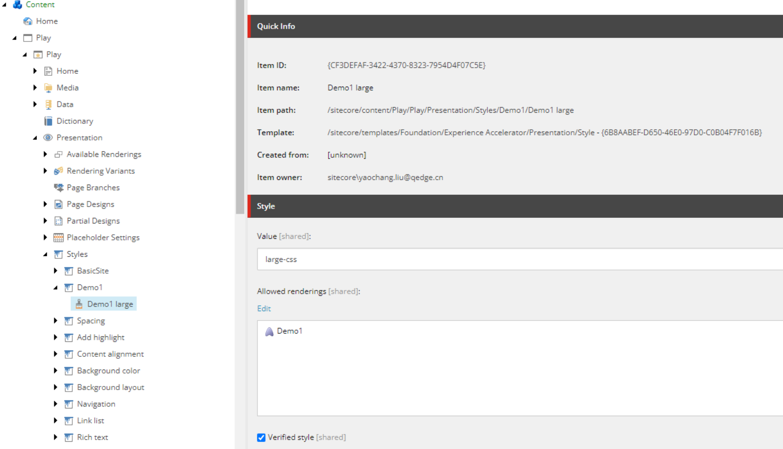
2. FE coding
Add scss
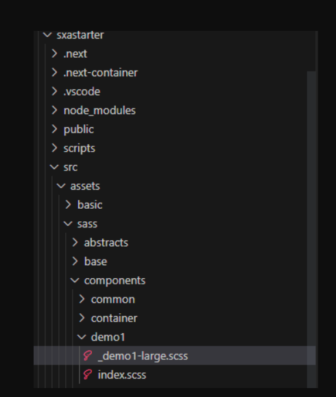
@import "@sass/abstracts/vars";
@import "@sass/abstracts/mixins";

.large-css {
    max-width: 960px;
    padding: 0;
    border-top-width: 3px;
    border-style: solid;
    overflow: visible;
    background-color: red;
}
3. Preview in Pages